Seaborn
Objective: Statistical visualizations.
High-level API based Matplotlib with strong integration of pandas.
import numpy as np
import pandas as pd
import seaborn as sns
import matplotlib.pyplot as plt
df = sns.load_dataset("penguins")
df.head(3)
| species | island | bill_length_mm | bill_depth_mm | flipper_length_mm | body_mass_g | sex | |
|---|---|---|---|---|---|---|---|
| 0 | Adelie | Torgersen | 39.1 | 18.7 | 181.0 | 3750.0 | Male |
| 1 | Adelie | Torgersen | 39.5 | 17.4 | 186.0 | 3800.0 | Female |
| 2 | Adelie | Torgersen | 40.3 | 18.0 | 195.0 | 3250.0 | Female |
High-level API:
Seaborn functions work on entire datasets and take care of many steps, such as aggregating data automatically.
Example: relplot
The relplot function is designed to visualize static relationships of all kinds:
sns.relplot(
    x="bill_length_mm", y="bill_depth_mm",
    data=df,
)
<seaborn.axisgrid.FacetGrid at 0x157e693d0>

With the help of a few arguments of the plotting function, you can add more variables to the plot.
Here, for example, the coloring of the scatter dots indicates the species of the penguins:
sns.relplot(
    x="bill_length_mm", y="bill_depth_mm",
    hue="species",
    data=df,
)
<seaborn.axisgrid.FacetGrid at 0x16c802690>

We can also change the dot's size according to their weights
sns.relplot(
    x="bill_length_mm", y="bill_depth_mm",
    hue="species",
    size="body_mass_g",
    data=df,
)
<seaborn.axisgrid.FacetGrid at 0x16c91a150>

Using the parameters col and row, multiple plots can be created based on a categorical variable:
sns.relplot(
    x="bill_length_mm", y="bill_depth_mm",
    hue="sex",
    size="body_mass_g",
    col="species",
    row="island",
    data=df,
)
<seaborn.axisgrid.FacetGrid at 0x16c94e810>

Continuous relationships can also be visualized using line plots (more on that later)...
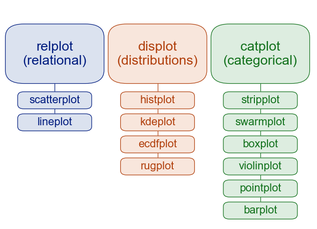
Distributions
Generate histograms or similar plots.
sns.displot(
    x="body_mass_g", col="species",
    hue="sex",
    kde=True,
    data=df
)
<seaborn.axisgrid.FacetGrid at 0x17f447450>

sns.displot(
    x="body_mass_g", col="species",
    hue="sex",
    kind="kde",
    data=df
)
<seaborn.axisgrid.FacetGrid at 0x16c88edd0>

Categorical data
Generate plots showing distributions split by certain values for categorical variables.
sns.catplot(
    x="species", y="body_mass_g",
    kind="boxen",
    data=df
)
<seaborn.axisgrid.FacetGrid at 0x17f52dc50>

However, it also works without classes...
sns.catplot(
    y="body_mass_g",
    kind="box",
    data=df
)
<seaborn.axisgrid.FacetGrid at 0x31b48a210>

sns.catplot(
    x="species", y="body_mass_g",
    kind="violin",
    data=df
)
<seaborn.axisgrid.FacetGrid at 0x31b50f450>

sns.catplot(
    x="species", y="body_mass_g",
    hue="sex",
    data=df
)
<seaborn.axisgrid.FacetGrid at 0x16c939650>

sns.catplot(
    x="species", y="body_mass_g",
    hue="sex",
    kind="swarm",
    data=df
)
<seaborn.axisgrid.FacetGrid at 0x31b5a4950>

sns.catplot(
    x="species", y="body_mass_g",
    hue="sex",
    kind="bar",
    data=df
)
<seaborn.axisgrid.FacetGrid at 0x31b491390>

Regression plot
Fits a regression model to the data to be visualized and also plots certain model parameters.
Can be a neat way to visualize (linear) relations within your data.
sns.lmplot(
    x="body_mass_g", y="bill_length_mm",
    hue="sex",
    col="species",
    data=df,
)
<seaborn.axisgrid.FacetGrid at 0x31b6cd4d0>

Multivariate Beziehungen
Especially in exploratory data analysis, it can be informative to plot different measurements or display formats in combination to gain more "global" insights.
The pairplot, for example, plots all variables of a data set against each other:
sns.pairplot(hue="species", data=df)
<seaborn.axisgrid.PairGrid at 0x31b56d790>

With the jointplot the display types histogram and scatterplot are combined:
sns.jointplot(
    x="flipper_length_mm", y="bill_length_mm",
    hue="species",
    data=df
)
<seaborn.axisgrid.JointGrid at 0x31c4e5210>

Seaborn and Pandas: Data Formats
Seaborn is designed to work with Panda's DataFrames.
The whole DateFrame can be passed with the data parameter and then columns can be selected using their name.
data = pd.DataFrame({
    "x": np.linspace(0, 20, 10000),
    "y": np.sin(np.linspace(0, 20, 10000))
})
sns.lineplot(x="x", y="y", data=data)
<Axes: xlabel='x', ylabel='y'>

However, Seaborn also accepts other data types:
x = np.linspace(0, 20, 10000)
y = np.sin(x)

sns.lineplot(x=x, y=y)
<Axes: >

sns.histplot(y)
<Axes: ylabel='Count'>

etc..
But of course you lose many of the helpful features of the DataFrame integration. (Most notably: Automatic axes labeling!).
DateFrames: Long- vs. Wide-form
DataFrames can contain data in different formats. For example, in longform format, where each variable has its own column.
Or in wideform format, which is more like traditional Excel spreadsheets and only contrasts two values.
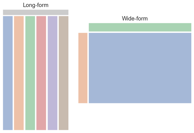
pandas is best at handling longform-based data:
flights = sns.load_dataset("flights")
flights.head()
| year | month | passengers | |
|---|---|---|---|
| 0 | 1949 | Jan | 112 |
| 1 | 1949 | Feb | 118 |
| 2 | 1949 | Mar | 132 |
| 3 | 1949 | Apr | 129 |
| 4 | 1949 | May | 121 |
Here the data for the vast majority of plots are automatically aggregated and correctly prepared.
For example, here the spread of the number of passenger per month is automatically aggregated by year:
sns.lineplot(x="year", y="passengers", data=flights)
<Axes: xlabel='year', ylabel='passengers'>

sns.lineplot(x="year", y="passengers", hue="month", data=flights)
<Axes: xlabel='year', ylabel='passengers'>

The same mechanism also works the other way round:
sns.lineplot(x="month", y="passengers", data=flights)
<Axes: xlabel='month', ylabel='passengers'>

sns.lineplot(x="month", y="passengers", hue="year", data=flights.query("month != 'Jan'"))
<Axes: xlabel='month', ylabel='passengers'>

Messy Data:
Some datasets also come in more complex formats. For example, different hierarchical levels could be mixed.
freqs = pd.read_csv("freqs-engl.txt", sep="\t")
freqs.head()
---------------------------------------------------------------------------
FileNotFoundError                         Traceback (most recent call last)
Cell In[28], line 1
----> 1 freqs = pd.read_csv("freqs-engl.txt", sep="\t")
      2 freqs.head()

File /opt/homebrew/Caskroom/miniconda/base/envs/python_intro/lib/python3.11/site-packages/pandas/io/parsers/readers.py:912, in read_csv(filepath_or_buffer, sep, delimiter, header, names, index_col, usecols, dtype, engine, converters, true_values, false_values, skipinitialspace, skiprows, skipfooter, nrows, na_values, keep_default_na, na_filter, verbose, skip_blank_lines, parse_dates, infer_datetime_format, keep_date_col, date_parser, date_format, dayfirst, cache_dates, iterator, chunksize, compression, thousands, decimal, lineterminator, quotechar, quoting, doublequote, escapechar, comment, encoding, encoding_errors, dialect, on_bad_lines, delim_whitespace, low_memory, memory_map, float_precision, storage_options, dtype_backend)
    899 kwds_defaults = _refine_defaults_read(
    900     dialect,
    901     delimiter,
   (...)
    908     dtype_backend=dtype_backend,
    909 )
    910 kwds.update(kwds_defaults)
--> 912 return _read(filepath_or_buffer, kwds)

File /opt/homebrew/Caskroom/miniconda/base/envs/python_intro/lib/python3.11/site-packages/pandas/io/parsers/readers.py:577, in _read(filepath_or_buffer, kwds)
    574 _validate_names(kwds.get("names", None))
    576 # Create the parser.
--> 577 parser = TextFileReader(filepath_or_buffer, **kwds)
    579 if chunksize or iterator:
    580     return parser

File /opt/homebrew/Caskroom/miniconda/base/envs/python_intro/lib/python3.11/site-packages/pandas/io/parsers/readers.py:1407, in TextFileReader.__init__(self, f, engine, **kwds)
   1404     self.options["has_index_names"] = kwds["has_index_names"]
   1406 self.handles: IOHandles | None = None
-> 1407 self._engine = self._make_engine(f, self.engine)

File /opt/homebrew/Caskroom/miniconda/base/envs/python_intro/lib/python3.11/site-packages/pandas/io/parsers/readers.py:1661, in TextFileReader._make_engine(self, f, engine)
   1659     if "b" not in mode:
   1660         mode += "b"
-> 1661 self.handles = get_handle(
   1662     f,
   1663     mode,
   1664     encoding=self.options.get("encoding", None),
   1665     compression=self.options.get("compression", None),
   1666     memory_map=self.options.get("memory_map", False),
   1667     is_text=is_text,
   1668     errors=self.options.get("encoding_errors", "strict"),
   1669     storage_options=self.options.get("storage_options", None),
   1670 )
   1671 assert self.handles is not None
   1672 f = self.handles.handle

File /opt/homebrew/Caskroom/miniconda/base/envs/python_intro/lib/python3.11/site-packages/pandas/io/common.py:859, in get_handle(path_or_buf, mode, encoding, compression, memory_map, is_text, errors, storage_options)
    854 elif isinstance(handle, str):
    855     # Check whether the filename is to be opened in binary mode.
    856     # Binary mode does not support 'encoding' and 'newline'.
    857     if ioargs.encoding and "b" not in ioargs.mode:
    858         # Encoding
--> 859         handle = open(
    860             handle,
    861             ioargs.mode,
    862             encoding=ioargs.encoding,
    863             errors=errors,
    864             newline="",
    865         )
    866     else:
    867         # Binary mode
    868         handle = open(handle, ioargs.mode)

FileNotFoundError: [Errno 2] No such file or directory: 'freqs-engl.txt'
Example: Comparing the frequencies of you and thoufor tragedies and comedies.
To generate a histogram of the frequencies of the two words for both genres, we need to convert the data into long-form using the .melt method of DataFrames.
plot_df = freqs.query("genre == 'tragedy' or genre == 'comedy'").melt(
    id_vars=["genre", "title", "year"],
    value_vars=["you", "thou"],
    var_name="token",
    value_name="freq"
)
plot_df
Since we lose data by applying this transformation, it is recommended to save the result in a new DataFrame...
sns.displot(
    x="freq",
    hue="token",
    col="genre",
    kde=True,
    data=plot_df
)
Matplotlib als Seaborn-Backend und weitere Anpassungsmöglichkeiten.
seaborn uses matplotlib as a backend framework to create the plots.
This means, it is to extend seaborn plots with matplotlib.
However, this is not necessary in all cases where you want to customize seaborn plots, because seaborn itself also provides some functions for this.
For this you have to distinguish between two types of plots:
axes_levelplotsfigure_levelplots
axes_level plots return a matplotlib axes object containing the plot while figure_level plots return a FacetGrid object containing the plot.
FacetGrid
FacetGrid objects are special containers that seaborn uses to encapsulate one (or more) graphic(s) and the data they generate.
df.head(3)
| species | island | bill_length_mm | bill_depth_mm | flipper_length_mm | body_mass_g | sex | |
|---|---|---|---|---|---|---|---|
| 0 | Adelie | Torgersen | 39.1 | 18.7 | 181.0 | 3750.0 | Male |
| 1 | Adelie | Torgersen | 39.5 | 17.4 | 186.0 | 3800.0 | Female |
| 2 | Adelie | Torgersen | 40.3 | 18.0 | 195.0 | 3250.0 | Female |
g = sns.FacetGrid(df)

You can assign individual columns and rows of a 'FacetGrid' to specific variables from the data set.
g = sns.FacetGrid(df, col="species", row="sex", hue="island")

Using the .map method of Facetgrid, it is possible to apply various plotting functions to each subplot (and its associated data) of a FacetGrid.
g.map(sns.scatterplot, "body_mass_g", "bill_length_mm")
g.add_legend()
g.figure

Certain plotting functions of Seaborn require the data as DataFrame via the data parameter. To apply those functions to the FacetGrid too, you can use the .map_dataframe method.
g = sns.FacetGrid(df, col="species", row="sex", hue="island")

g.map_dataframe(sns.swarmplot, y="body_mass_g")
g.add_legend()
g.figure

FacetGrid objects encapsulate the subplots they contain in the axes attribute.
g.axes
array([[<Axes: title={'center': 'sex = Male | species = Adelie'}, ylabel='body_mass_g'>,
        <Axes: title={'center': 'sex = Male | species = Chinstrap'}>,
        <Axes: title={'center': 'sex = Male | species = Gentoo'}>],
       [<Axes: title={'center': 'sex = Female | species = Adelie'}, ylabel='body_mass_g'>,
        <Axes: title={'center': 'sex = Female | species = Chinstrap'}>,
        <Axes: title={'center': 'sex = Female | species = Gentoo'}>]],
      dtype=object)
g.axes[0][0].set_title("1.")
g.axes[0][1].set_title("2.")
g.figure

The entire graphic is stored in the figure attribute.
These objects are again classic matplotlib graphics and can be adapted or processed accordingly.
g.figure.suptitle("My first custom FacetGrid :-)", y=1.1)
g.figure

The advantage of 'FacetGrids' is that you can create and customize your own plots quite flexibly without having to drop any of seaborn's convenient features.
figure_level-Plots
High-level plot functions, such as relplot, catplot or displot mostly return a FacetGrid object.
g = sns.catplot(x="species", y="body_mass_g", hue="sex", data=df)

type(g)
seaborn.axisgrid.FacetGrid
Since FacetGrid serve as containers for axes, figure, they are poorly adapted to other graphics and should be used to create a coherent graphic.
axes_level-Plots
As the name suggests, axes_level plots return a matplotlib axes object.
axes_level plots are intended to be a drop-in replacement for matplotlib functions and can be well integrated into other plots or matplotlib workflows.
data.head(3)
| x | y | |
|---|---|---|
| 0 | 0.000 | 0.000 |
| 1 | 0.002 | 0.002 |
| 2 | 0.004 | 0.004 |
fig, axes = plt.subplots(2, 1)
axes[0].plot(data["x"], data["y"])
axes[0].set_title("Sine Curve")
sns.histplot(x=data["y"], ax=axes[1])
axes[1].set_title("Histogram of sine values")
fig.tight_layout()
fig.suptitle("Example for a combined matplotlib and seaborn plot", y=1.1)
plt.show()
